Countless studies have shown the importance of accessing daylight and views in Healthcare spaces and specifically in Behavioral Healthcare spaces. The goal of the BH environment is to normalize patients as part of their treatment; to help them create a sense of rigor and structure to their day. Access to the sun as the driver of human circadian rhythms is essential to an effective therapeutic environment and wellness. Today I am comparing four recent projects with different solutions to daylight and views.
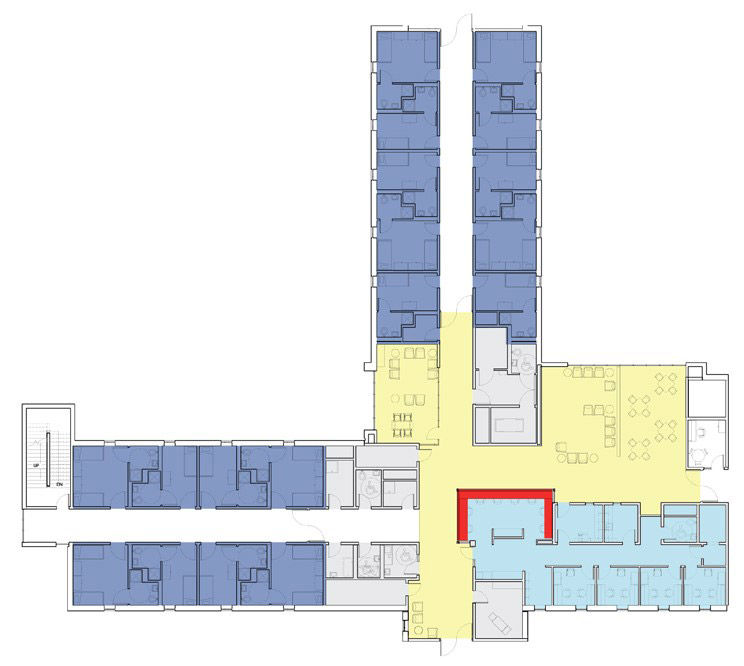
The Project 1 unit design represents a common archetype for a behavioral health unit with the unit forming an off-center “plus sign” so that narrow fingers ensure that all areas of the unit have access to windows. The social and therapeutic spaces, located at the small end of the “+” have large windows looking outside into courtyards or secure green spaces where they can see and be affected by the rhythm of nature without any privacy issues associated with being seen by the public.
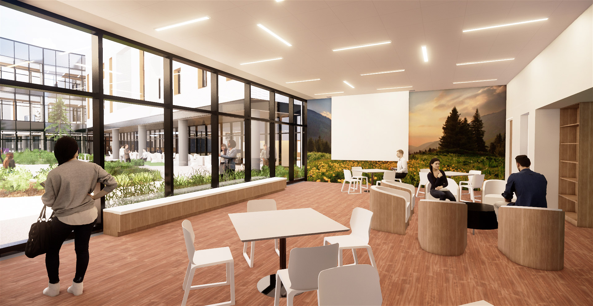
The Project 2 building has the units arranged around a central courtyard which is secure and private, allowing large viewing windows to nature on a tight semi-urban site. Because the design and clinical team where able to control the areas available as views, the unit windows are carefully crafted to “frame” views that maximize the effect from within the unit. This unit is much deeper than the narrow fingers of the Project 1 unit, so getting ample daylight into the space was a critical design driver. The fairly simple and open social space design is heavily influenced by sun studies and social dynamics testing to create a space that gives patients significant access both to the sun and to nature.
The project 3 unit provided a challenge to natural light. As an addition to an existing hospital, the location was challenging and tight. Because the unit is on the second level of a two level addition, we separated the two sides of the unit, creating roof gardens between them to create two courtyards; one for meditative activities and one for exercise related activities. The result of this move is an open flow between inside and outside, so patients not only have views of nature, but they are able to move in and out of it with a certain degree of freedom without compromising either security or privacy.
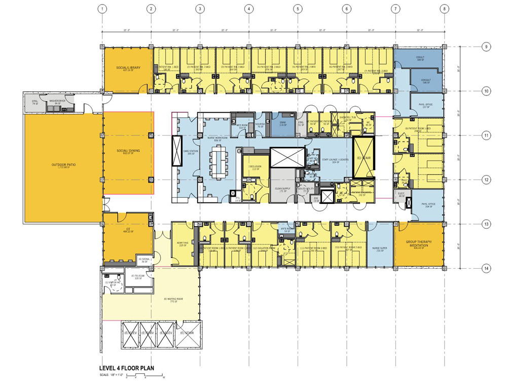
The Project 4 unit, a renovation of existing space, had ample windows available in the space prior to its conversion so daylighting was available, but the deep footprint meant the spaces that could do without light had to be carefully located in the inner core rather than around the perimeter. That meant that staff spaces had no windows. However, as we worked with the clinicians to determine their operating protocols, we learned their preference was to encourage staff to be on the floor with patients as their first priority and sitting at the open nurse station as their second priority. Only activities that required acoustical privacy were to take place behind closed doors. Because the nurse station is directly adjacent to the large windows of the social activity space, we found that the design actually supports the operating paradigm, providing encouragement for staff to be where the sunshine is. In Santa Barbara, that is no small amentity!